Click image for full resolution
Click image for full resolution
|
Click image for full resolution |
Click image for full resolution |
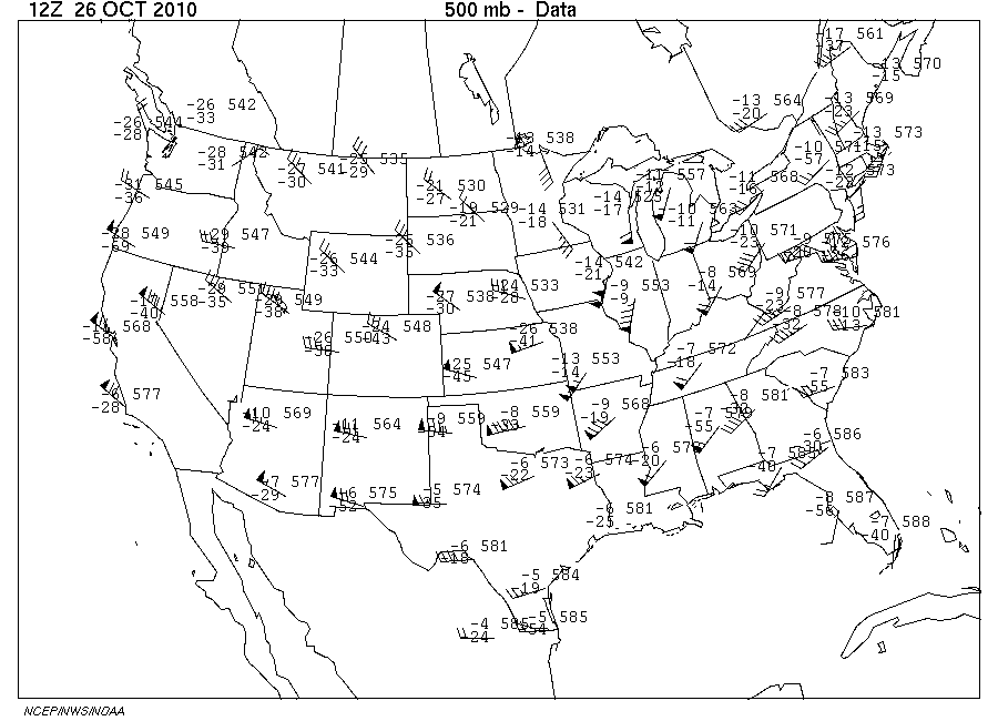
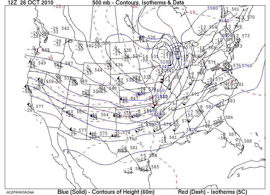
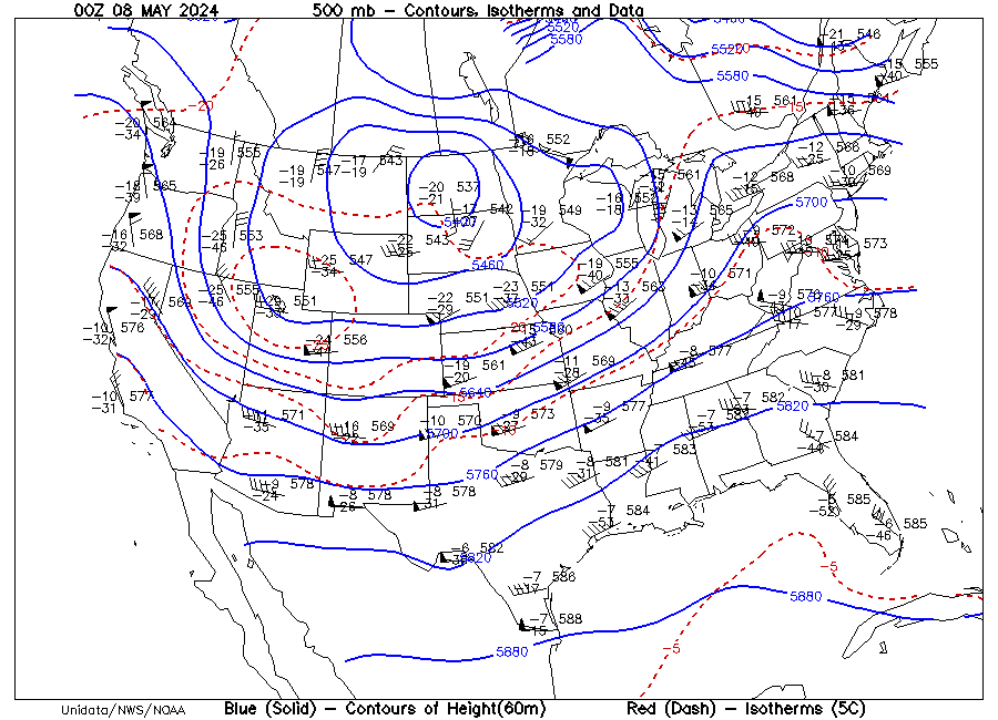
| Click here for latest 500 mb Data chart from website | Click here for latest Analyzed 500 mb map from website |
The map on the left is constructed from data collected at a pressure value of 500 mb (about half of sea level pressure) from the network of rawinsonde stations across the conterminous U.S. The data are plotted in an upper air station model where the forward end of the wind barb is at the upper air station site. For a description of the upper air station model, click here.
Analysis lines:
 Click image for full resolution |
 Click image for full resolution |
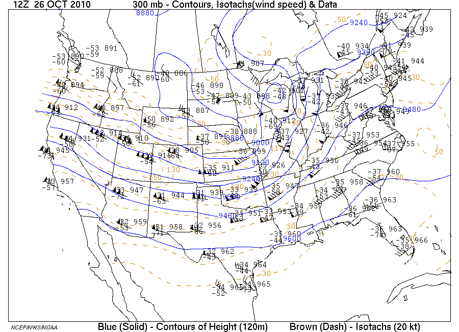
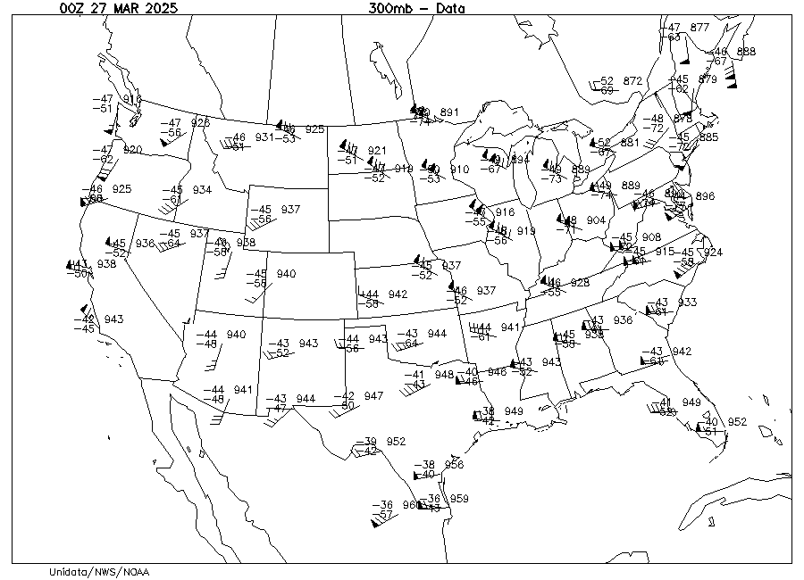
| Click here for latest 300 mb Data chart from website | Click here for latest Analyzed 300 mb map from website |
Analysis lines:
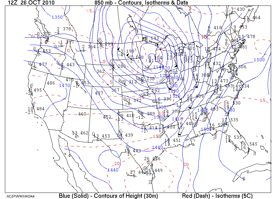
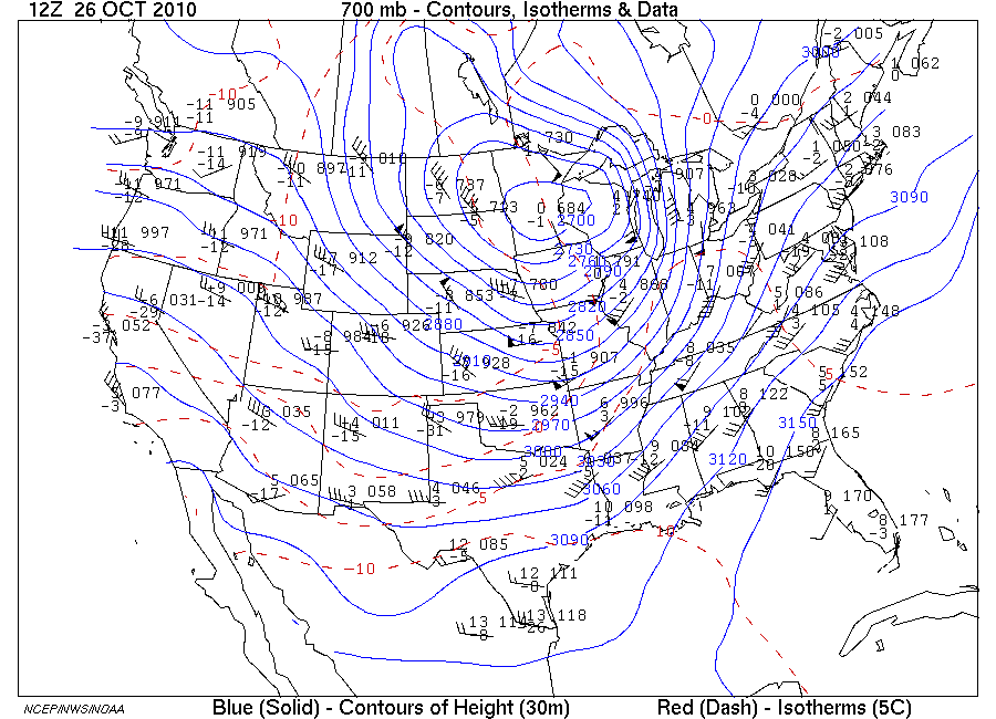
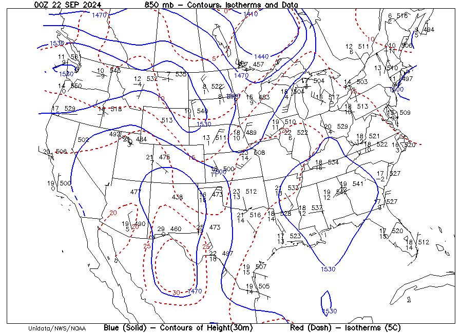
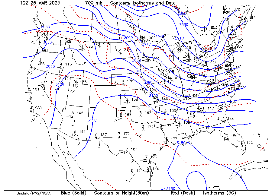
| Click for a sample: | 850 mb map | 700 mb map |
| Click for the latest chart from the website: | 850 mb map | 700 mb map |
On these upper air maps, altitude at which the chosen pressure
occurs is given in
meters, coded to conserve space on the map. One needs to add one or
more digits
to decode the actual altitude from the station model.
| Pressure Level (mb) |
Average Altitude (m) * |
Coded Map Digits (xxx from station model) |
Altitude (ft.) * |
| 850 | 1457 | 1xxx | 4781 |
| 700 | 3012 | 2xxx or 3xxx |
9882 |
| 500 | 5574 | xxx0 | 18 289 |
| 300 | 9164 | xxx0 | 30 065 |
Upper air charts are typically drawn for "surfaces"of constant
pressure, that is, assembled from data collected twice daily by
rawinsondes at
that particular pressure value. The routine pressure values for which
upper air
maps are displayed by the DataStreme Atmosphere homepage are: 850 mb,
700 mb,
500 mb, 300 mb. Additional data are collected including so-called
mandatory
levels from each rawinsonde measurement profile (if sufficient altitude
is
achieved): 1000, 925, 850, 700, 500, 400, 300, 250, 200, 150, 100, 85,
70, 50,
40, 30, 25, 20, 15, 10 mb.
| Back to Contents | DataStreme Atmosphere Webpage |