-
- AMS_ClimateChange_002.jpg
-
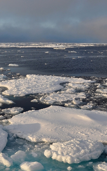
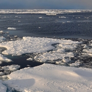
Fragmented Arctic sea ice, September 2009. (Patrick Kelly/U.S. Coast Guard)
-
- AMS_ClimateChange_004.png
-
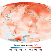
The change in surface temperature for the period 2000–2009 relative to 1951–1980 was calculated by NASA’s Goddard Institute for Space Studies using data from surface weather stations for land areas and satellite-derived temperature estimates for the oceans. Gray areas denote places where temperatures were not recorded. The warmth was especially prominent at high northern latitudes, as predicted by computer models. (NASA Earth Observatory)
-
- AMS_ClimateChange_008.jpg
-
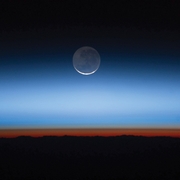
The densest part of Earth’s atmosphere extends only a few kilometers above the surface, as shown in this photo taken from the International Space Station. The orange sky near the bottom represents the troposphere, or “weather layer,” where temperatures have been warming. Above this layer is the stratosphere, seen here as a light gray region, where temperatures have been cooling and ozone depletion has been a concern over recent decades. (NASA Earth Observatory)
-
- AMS_ClimateChange_010.png
-
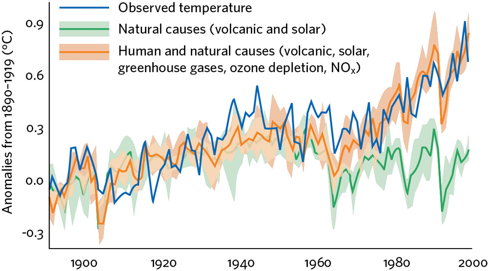
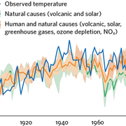
The orange and green shaded areas show the departure of twentieth-century global temperature from the 1890–1919 average, as produced by four computer model simulations. The orange and green lines show averages of the four models. The green runs factor in natural agents of climate change only; the orange runs include both human and natural factors. The blue line shows the temperature measured in the real world. (Parallel Climate Model/DOE/NCAR)
-
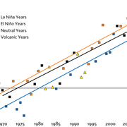
- AMS_ClimateChange_013.png
-
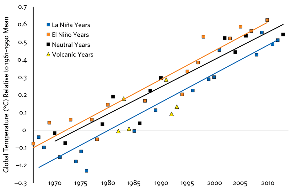
Global temperatures have trended above their twentieth-century averages since the late 1970s. The blue squares show years when the influence of La Niña predominated. Normally cooler than El Niño years (orange squares), La Niña years have been occurring more often this century, which appears to have helped temper long-term atmospheric warming. However, even La Niña years are now warmer than they used to be. (Dana Nutticelli/John Cook/SkepticalScience.com)
-
- AMS_ClimateChange_015.png
-
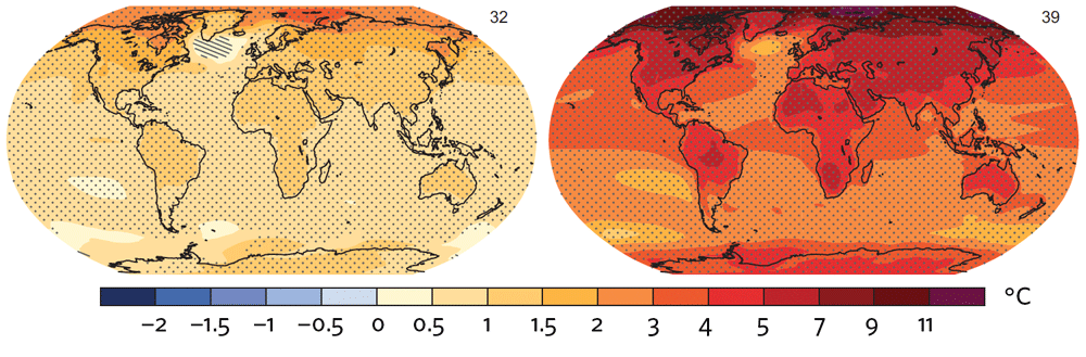
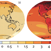
Change in annual mean surface temperature from the period 1986–2005 to 2081–2100 for two scenarios, the low-end RCP2.6 (left) and the high-end RCP8.5 (right). These represent the averages from more than 30 climate models. In the areas covered by dots, the indicated changes are large relative to natural variability and at least 90% of the models agree on the sign of the change. Crosshatched areas indicate where the change is small compared to natural variability. (IPCC)
-

- AMS_ClimateChange_018.jpg
-
Much of the low-lying Sundarbans region of southwest Bangladesh and southeast India—one of the world’s largest preserves of tidal mangrove forest—could be inundated this century by sea level rise, which will also threaten millions of nearby delta residents. (NASA image created by Jesse Allen, Earth Observatory, using data obtained from the University of Maryland’s Global Land Cover Facility.)