-
- AMS_ClimateChange_029a.png
-
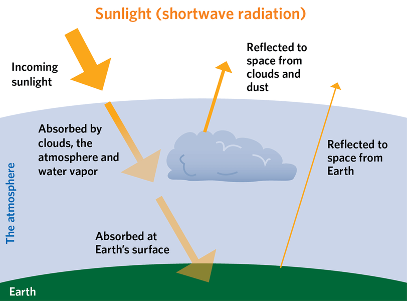
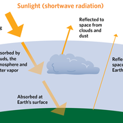
Incoming and outgoing radiation: the diagram above shows sunlight entering the atmosphere. The light absorbed (as opposed to reflected) is given out as infrared radiation, as shown in the diagram below. The widths of the arrows in both diagrams reflect the warming power of each process, relative to the total sunlight coming in.
-
- AMS_ClimateChange_029b.png
-
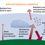
Incoming and outgoing radiation: the diagram above shows sunlight entering the atmosphere. The light absorbed (as opposed to reflected) is given out as infrared radiation, as shown in the diagram below. The widths of the arrows in both diagrams reflect the warming power of each process, relative to the total sunlight coming in.
-
- AMS_ClimateChange_031a.jpg
-
- AMS_ClimateChange_031b.png
-
- AMS_ClimateChange_032.jpg
-
- AMS_ClimateChange_033.jpg
-
- AMS_ClimateChange_034.jpg
-
- AMS_ClimateChange_035.jpg
-
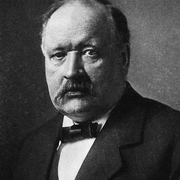
Svante Arrhenius
-
- AMS_ClimateChange_037.jpg
-
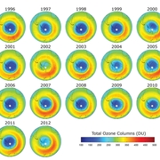
Satellite-derived measurements of total ozone above the South Pole in Dobson units, averaged for the period September through November. Deeper blues indicate a stronger ozone hole. The 2012 hole was the weakest in a decade. (European Space Agency)
-
- AMS_ClimateChange_039.png
-
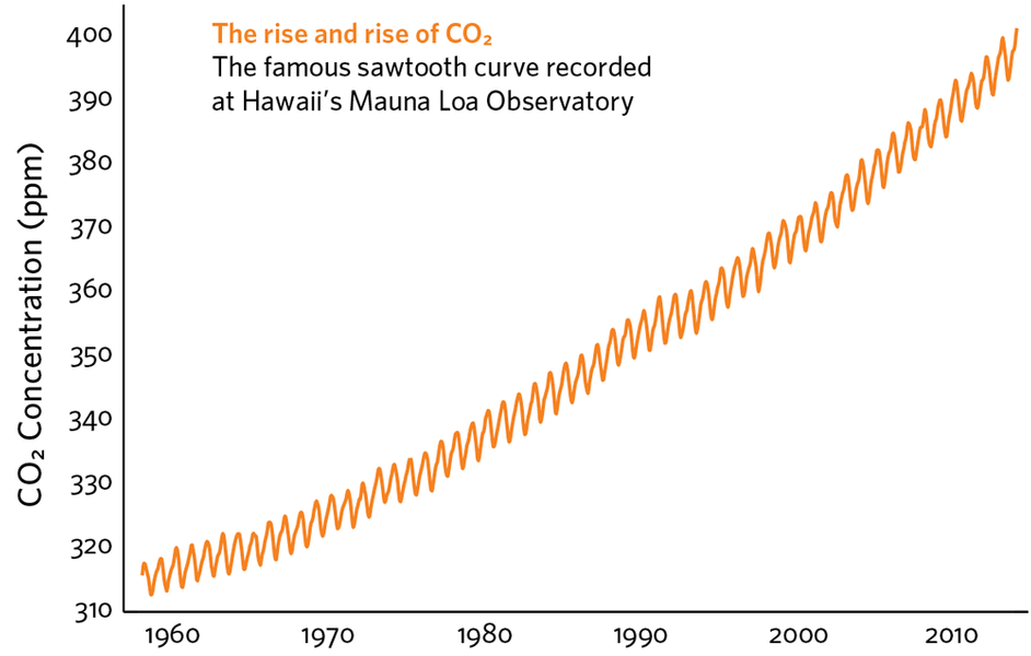
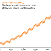
Carbon dioxide measurements taken on top of Hawaii’s Mauna Loa since 1958 have produced this famous saw-toothed curve. The annual ups and downs reflect the cycle of plant growth and decay concentrated in the Northern Hemisphere, where land areas are more extensive. (Scripps Institution of Oceanography)